

OUR NEW BRAND
A distinctive identity that communicates one clear set of values with commercial confidence
At Eyetonic, our vision is to be the best environmental graphics company in Australia, as seen through the eyes of our customers, shareholders, and employees. We expect and demand the best we have to offer by always keeping Eytonic’s values top of mind. One consistent brand story will strengthen Excpocentric for employees and customers.
Inside Eyetonic, the brand story provides a focal point for all of the incredible talent we have in our office. It’s a rallying cry to drive us, and a shared ambition to connect us.
Externally, aligning our brand around a single concept mirrors the integration we offer clients. Our unified story will create a seamless flow between how our systems function and how our company is perceived.
With this inclusive brand story, Eyetonic will gain a memorable, unique position in the print media landscape. We will be seen as an authority, and as a motivating force.

One of the most important ways of expressing our brand is through our identity. It sums up what we stand for by reflecting our values and giving a feel for the quality and service that can be expected from Eyetonic, both in New South Wales, and nationaly.
These brand guidelines explain the many different elements that
make up our identity and describes how they work together.
Our brand is more than our logo – It is a design scheme made up of a number of core elements and guiding principles that combine to create a distinctive look and feel that is immediately recognisable as Eyetonic.
OUR BRAND ESSENCE
This is the emotional heart of a brand, summed up in a few words. Our Brand Essence captures and communicates the conceptual subtleties of the brand.

This is not a campaign but the driving force behind all expressions of our brand. It will span all campaigns and manifest itself on every communication.
“See the Difference” will complement and extend the brand, reinforcing our position as a market leader in large format solutions.
To maintain conceptual consistency of the message, the brand essence can be subtly changed using Eyetonics brand Palette to create “the difference”.
OUR COLOURS
Colour plays a vital role in building the Eyetonic brand identity and establishing awareness in the minds of our target audience.
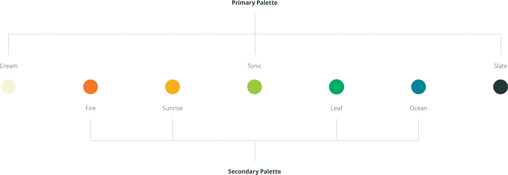
By using our palette consistently across all of our communication materials, we will build recognition and associations for the brand. Eyetonic colours are a comrehensive span the colour spectrum. The spectral colours have been selected as a foundation from which to build colour combinations.
PRIMARY PALETTE
Primary Palette colours serve as a foundation that works universally across all of the Eyetonic materials.
Our yellow (“Sunshine”) is made of 100% Yellow, with a touch of Magenta to help it pop off a white page. The blue (or “sky”) is
made from 100% Cyan and a little Magenta to add warmth. Finally our Grey (or “Pure) is made from 90% Black and 30% Blue. This ensures a strong print finish across all our media.
SECONDARY PALETTE
The larger secondary palette should only be used for subordinate purposes in communication materials. These colours should be used sparingly to help differentiate information in tables and charts, and should never be used dominantly or in large areas.